November 2, 2021
Overview
In this blog we will explain how to:
- Access Advanced Analytics reporting for Engagement and Custom/Ad-Hoc surveys
- Navigate the different sections of an Advanced Analytics dashboard
- Filter the dashboard by a demographic / metadata field
- Export analytics pages to PDF
Workify’s Advanced Analytics dashboard was developed to give companies the ability to gain insights and answer questions around engagement data. The inspiration behind Workify’s reporting feature is to enable companies to view data in an easy to understand format, while also giving the ability to gain in-depth understanding of the data.
Accessing Advanced Analytics Reporting
To access the Advanced Analytics dashboards for any Engagement or custom survey:
- Go to the View Surveys page under the Employee Engagement tab.
- Then, find the survey you wish to view and click the Actions drop down on the right and select Analytics.
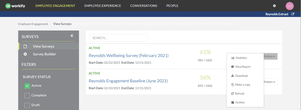
- Once you’re in the Advanced Analytics section, you’re ready to dive into your survey results.
Navigation
Pages
The pages on the left-hand side of the dashboard are used to navigate through the different sections and question types of a particular survey. The pages shown here will depend on the questions used in your survey.

Tabs
Each page also contains its own set of tabs that will allow you to visualize the questions in different ways.

Some tabs will allow you to change the visual displayed. These tabs will have a dropdown titled ‘Layout’ which will allow you to toggle between the different visual types.

Another drop down type is the ‘View by’ which will allow you to change the scoring system used on the likert questions.

On all Group By tabs you have the ability to select the demographic / metadata field you wish to group the scores by using the Group By dropdown.

On all Trend tabs you will be able to select the survey type or surveys you want to view by using the Survey dropdown.

Once you are on the tab you wish to view, we recommend expanding the page to full screen to best view the visuals. This can be accomplished by using the expand button on the top right corner.

From the expanded view you can use the escape button on your keyboard to exit this view.
Description of Analytics Pages and Tabs
Although the tabs and visuals vary for each page, the most common tabs found on each question type are:
- Overview: A snapshot of the overall data for the survey being viewed.
- By Group: Allows you to group the data by the different metadata fields we hold for your company
- Trend: View how the scores for the question type have changed survey over survey
The most common pages are:
- Scorecard: This view gives you all of your engagement KPIs on one page. This is typically populated for your company wide Engagement Surveys. It shows a summary of all the different elements of your Baseline Survey.
- Indicators: Scorecard view at the indicator level
- Questions: Scorecard view at the question level
- Participation: This section displays the overall participation for your entire company. Three components of participation are tracked: Completions, Partial Completions, and Not Started. All numbers are displayed by counts and percentages.
- Net Promoter Score: This section displays your company’s overall Employee Net Promoter Score. It shows the breakout of Promoters, Passives, and Detractors. Additionally, the calculation that generates eNPS is displayed. You can view demographic breakouts and trend reporting (if available).
- Retention: See the distribution of responses for how long employees plan to stay at the company. This distribution is displayed by both counts and percentages.
- Indicators: This displays all scores for engagement indicators from Workify’s Culture Model, or any company-specific indicators, for a selected survey.
- Scorecards: This page shows a snapshot of the overall scores similar to the overview page, but allows you to view the scores by each indicator.
- Likert Questions: View the scores for all likert questions as a heatmap or distribution of responses. The Workify Score displays on a -100 to 100 scale which is color coded from red to blue to help you easily identify strengths and areas for improvement.
- Qualitative: View all of the open ended responses to the selected qualitative questions. There is a word cloud that displays and sizes the most commonly used words in the selected set of responses.
- Single Choice: This tab shows the distribution of responses for all single choice questions asked in the survey. The question dropdown can be used to switch between different questions asked in the survey.
- Multi-Choice: Used to visualize all multi-choice questions with a similar layout as the single choice question tab.
- Question Group: Allows you to view sub-questions with a similar scale (e.g., Likert, etc) that have been grouped together into a single “Question Group”
- Ranged Response: View questions that are asked on a ranged scale (0 – 10 with 10 being the best) similar to how the eNPS question is scored.
- Ordered Options: This tab shows responses for a forced rank question type with where 1 is the highest score answer choice as well as average response which helps identify how closely or far apart the answer choices were ranked.
Learn more about question types here
Filtering Your Dashboard
Along the right hand side you’ll see the filter pane. If you click the arrow near the word “Filter,” the pane will expand/collapse. Using additional filters in Advanced Analytics is a powerful way to conduct further analysis. In order to protect anonymity, we only allow users to use two additional filters to drill deeper into your results.

The filters will be greyed out until a selection is made and then the filter will be highlighted green. You’ll use the First Filter or Second Filter to choose which metadata field you’d like to look at. Then, you’ll use the First Value or Second Value filters to choose the metadata group you want to view the results by.
Here’s an example. In this case, let’s say you wanted to filter the Scorecard page down to view the results for the Finance and Accounting Department. You would:
- Expand the First Demographic filter and select Department.
- Expand the filter titled “First Value” and select Finance and Accounting.

As you can see, we’ve chosen both of those necessary filters, and now the Scorecard page is displaying the results just for the Finance and Accounting department.

When the filters are used, each page will tell you along the top under the survey title which fields you have chosen. In this case, the Applied Filters: Department = Finance and Accounting.
If you need to clear any of the filters, just click the eraser icon.

Exporting to PDF
If there is a visual or reporting page you’re looking to share, the dashboards have a PDF button in the top right corner.

Once you select it, click Save as PDF. To ensure the colors display, choose the Background graphics checkbox before saving.
Each report contains an extensive amount of flexibility and functionality. If you have any questions about Advanced Analytics and its capabilities, please contact your Client Success Rep. or email us at clientsuccess@getworkify.com.